I recently received new product samples from my licensing agent! What started as a couple sketches on my iPad have now become cushy kitchen mats sold at Ross stores in the US. It’s always rewarding to see my ideas transform into physical products to be sold for others to enjoy. Here’s a peek at how the artwork evolved.
One Idea Leads to Another
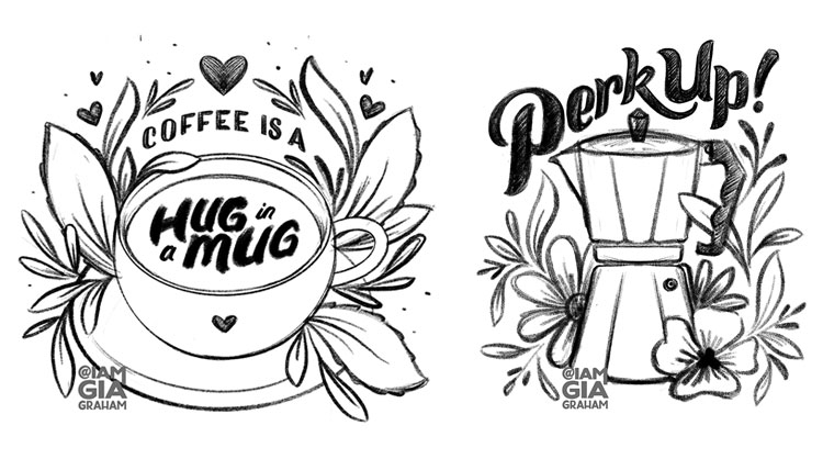
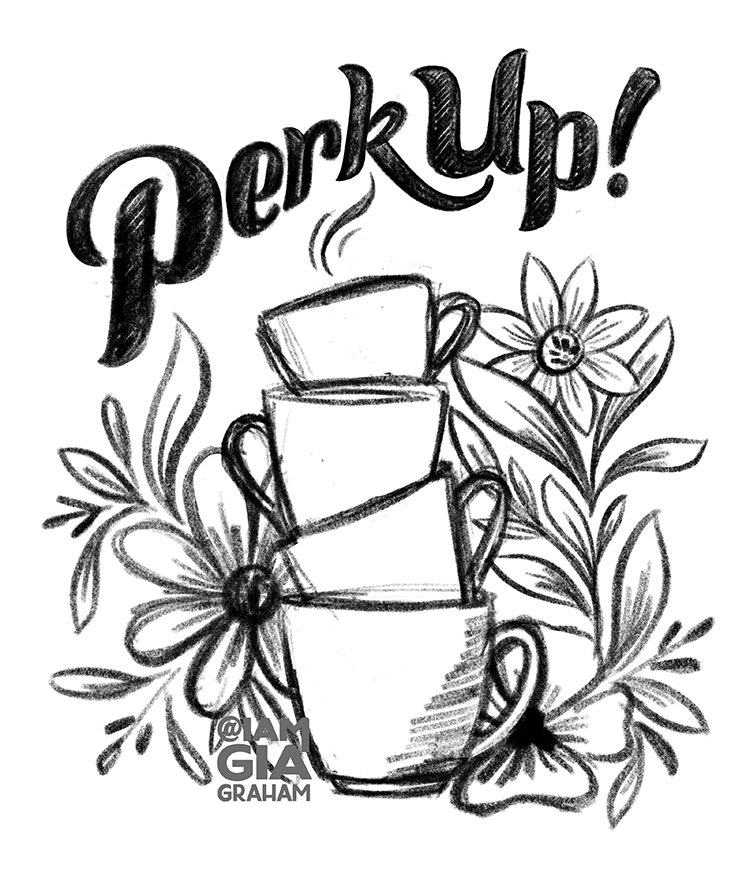
One of my favorite indulgences is a delicious homemade French Press latte in the afternoon – just when I need a little pick-me-up to help me push through to the end of the workday. I enjoy the ritual of grinding the beans, foaming the milk, getting the ratios just right, then savoring every sip. I enjoy it so much that I decided to draw a little sketch with coffee as the inspiration. I had a fairly common pun in mind and used it as the basis for this sketch:
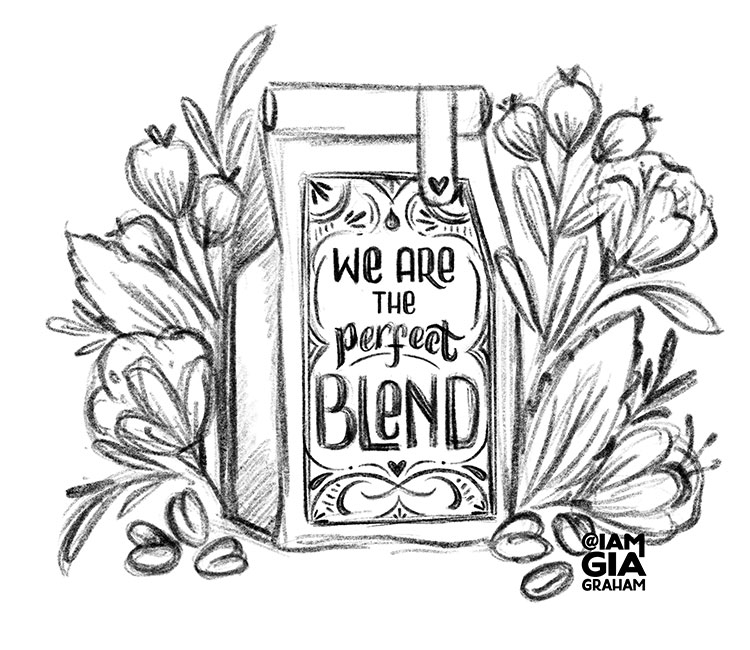
I thought the sketch turned out well so I decided to push it a little further and see what else I could come up with, using the same theme. These two sketches followed soon after:
This was in February 2024 and at that time, I was working with a palette of mostly pinks and reds (I’ve had a tradition of using one color palette per month for several years now) so I finalized and inked the illustrations in those colors. I also re-worked and re-colored an older lettering piece with the same theme and just like that, a mini collection was born.
Color Compromise
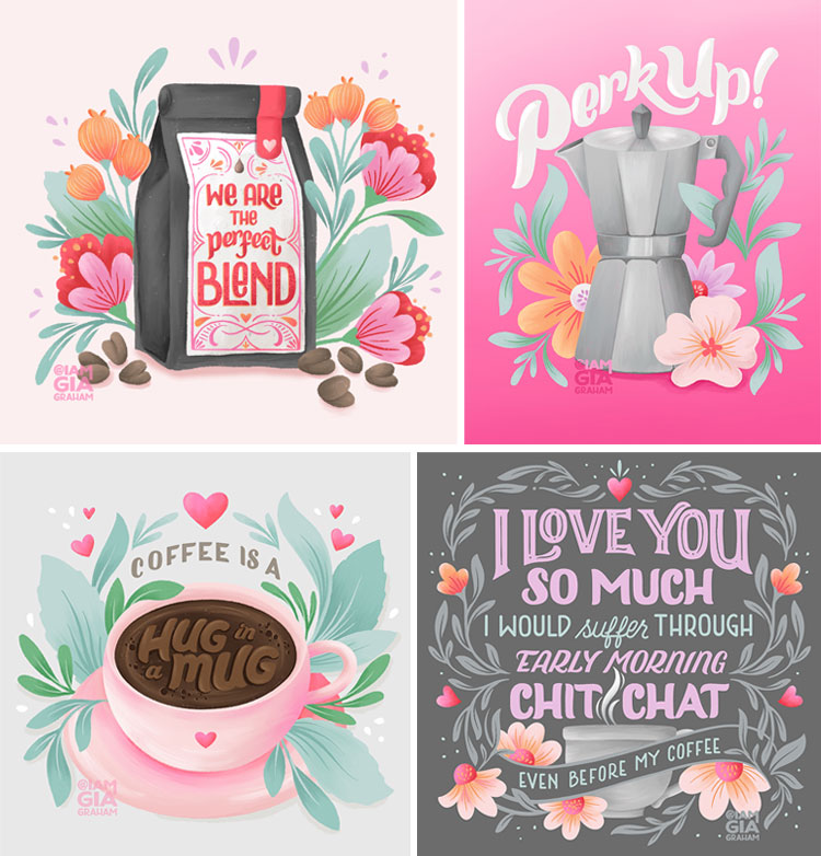
When I posted the illustrations on Instagram, my agent saw the potential and suggested I add them to my licensing portfolio. Although I loved the pink palette, I knew I would need to adjust the colors to be more appealing for licensing. The soft, sweet shades were right up my alley but they wouldn’t necessarily work for mass market so I re-colored each piece in a more practical palette of neutral tones. I rarely use shades of brown in my artwork but I managed to pull together a palette I was pleased with.
Seven Months Later…
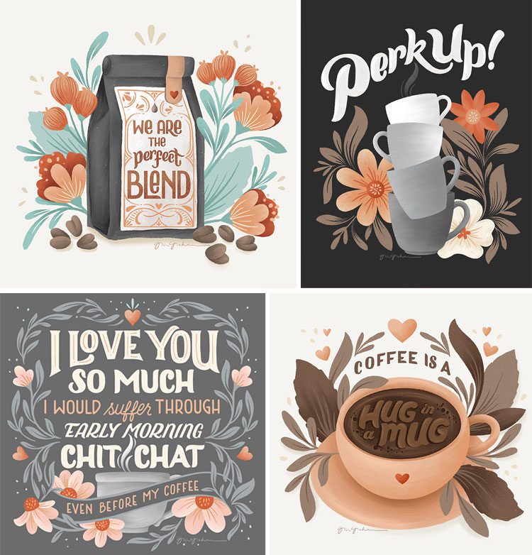
I got an email from my agent saying that a company was interested in the collection but they wanted to make a slight change. For the ‘Perk Up’ illustration, they wanted me to swap out the percolator for a stack of coffee mugs. Of course, the phrase ‘perk up’ was meant to be a percolator pun which is why I used them together but again, compromises often need to be made for mass market. Not everyone uses a percolator but most people drink their coffee from a mug, so the mugs would have a wider appeal. Yes, some of the creative intent would be lost but it would make more sense from a business standpoint.
The Result
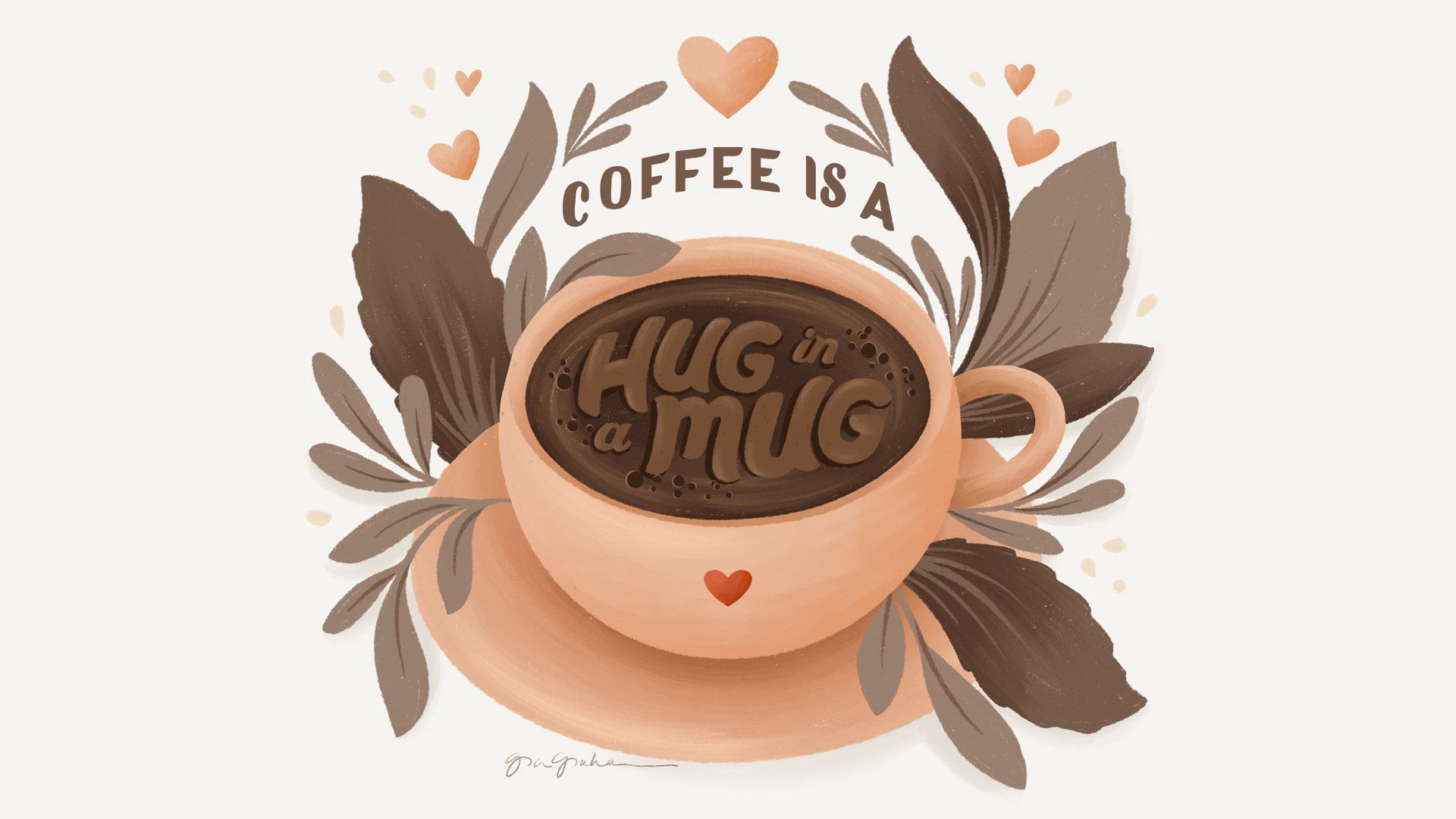
In the end, the client chose the ‘Perk Up’ illustration (further edited to fit a horizontal format) and the ‘Hug in A Mug’ piece. Although the colors weren’t what I would typically gravitate to and the layouts weren’t what I initially had in mind, those changes were exactly what the products needed. Here’s a look at the final result…
I’m really pleased with how they turned out. The print quality is great (accurate, rich colors) and the mats are well made. I have the ‘Hug in a Mug’ version in my kitchen right now and it’s so cushy and comfy to stand on while at the sink!
Large stores like Ross tend to move through inventory quickly, so I’m not sure how long they will be on shelves but let me know if you’ve seen them out in the wild! 🙂
I hope you enjoyed this peek behind the design. Let me know if you have any questions.
xo
Gia